
Skip to content
All resources
Digital tours10 min

QR codes in museums, open-air museums and gardens: how to get them right

A QR code can connect a display case, a plant, a historic room or a stop along a trail with a story available on a phone. But to be helpful, it needs to be in the right place, lead to easy-to-use content and clearly explain why it is worth scanning. A black square alone is not yet a digital guide, just as an inventory number is not yet an exhibition.

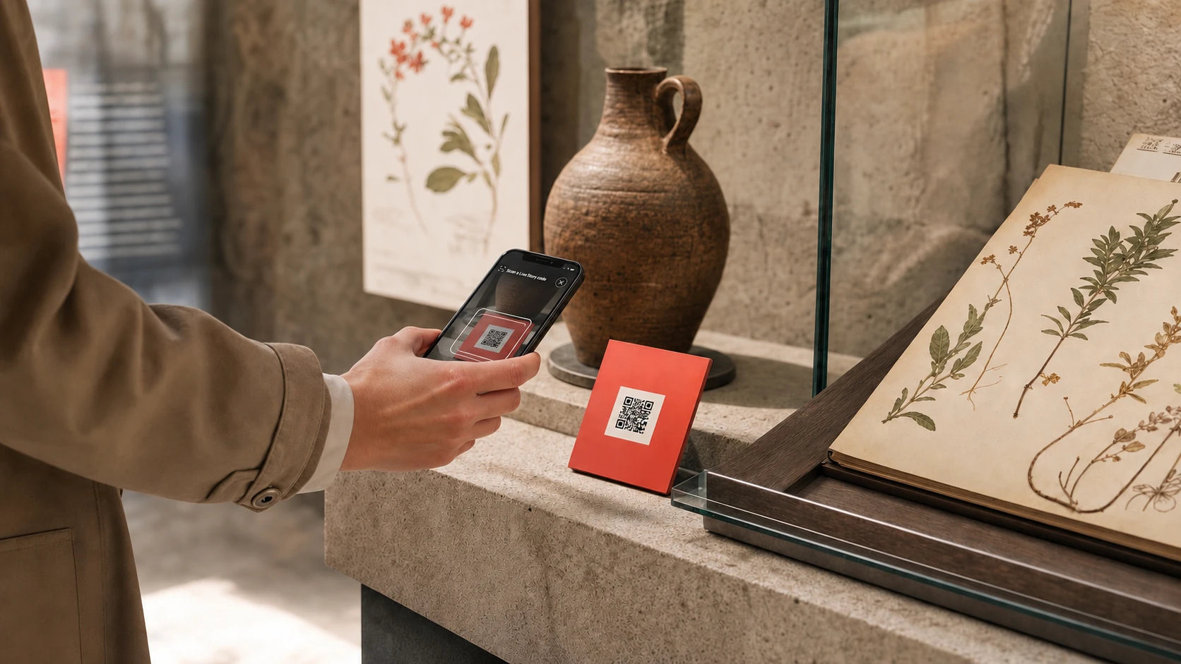
A female visitor scans a QR code beside a historic vessel and an open herbarium

A QR code is a gateway to a story, not the story itself

The most common mistake starts with the words: “Let's add QR codes.” That is a little like starting an exhibition design by choosing hinges for the display cases. A hinge is necessary, but it does not answer the question of what we want to show or why someone should stop right here.

A QR code is simply a convenient connection between a physical space and content. It can open an object description, an audio recording, a video, a translation, an activity for children or the next stage of a route. Its value comes not from its mere presence, but from whether scanning gives visitors something they could not easily read on the label beside the exhibit.

A well-designed code does not compete with the object. It remains discreet but visible, while a short instruction promises a specific benefit. “Listen to the story of this painting's conservation” works better than “Scan the QR code” on its own. A herbarium label also serves a purpose because it describes the plant, not because it has been carefully stuck in place.

Start with the visitor journey and the visitor's needs

Before creating the first code, it is worth walking the route as someone visiting for the first time would. Where do they look for the starting point? At what point do they lack context? When do they need a translation, a recording or a simple indication of where to go next? The answers shape the visitor journey far better than a spreadsheet with a “has QR / no QR” column.

A family with children needs different help from a school group, and a tourist with forty minutes before their train departs needs something different again. This does not mean creating a separate app for each person. Often, a single page for each stop is enough, with a short description, an audio option, a language selector and a clear way to move on to the next place.

It is also worth deciding what should happen after a scan. Should visitors understand the significance of an object, see a hidden detail, listen to an eyewitness's recollection, identify a plant species or begin the entire route?

  • Identify who visits the place most often and the conditions in which they use their phones.
  • Define one main need that each type of code should address.
  • Plan the next step after visitors have read or listened to the content.
  • Test the journey in the actual space, not just at your desk.

Choose stops that genuinely deserve a QR code

Not every exhibit, specimen or section of wall needs its own code. Too many signs create visual noise, and visitors quickly stop distinguishing essential content from supplementary information. In a botanical garden, a forest of QR signs can begin to look like a new, rather angular species of undergrowth.

Start by choosing stops where a digital layer adds clear value. These might be objects central to the story, places that need further explanation, stops with interesting audio or video material, and entry points to the next sections of a route. Another good candidate is an object that cannot be shown in full: a manuscript open at one page, a delicate textile kept in dim light or a plant that is attractive for only part of the season.

A pilot with ten carefully considered stops teaches you more than printing a hundred codes at once. It lets you see where people actually scan, how much content they read and whether the signs are visible. Only then is it worth extending the system to more rooms, garden paths or trail stops.

Design physical signage that people can notice and scan

The code should be placed where visitors naturally pause beside an object. Not too low, not too high and not somewhere that requires leaning over a barrier. Visitors may admire the vaulting in a crypt, but scanning should not require the pose of a late medieval acrobat.

The size of the code depends on the scanning distance, print quality and lighting conditions. There is no single size that works in every space, so the design needs to be tested on site and on several phones. Strong contrast, a sharp print and clear space around the code are important. The QR specification calls this a “quiet zone”: the empty border helps the camera distinguish the code from its background.

Place a short, specific instruction beside the code. Explain what awaits visitors after scanning: “Listen to the story”, “See a detail hidden in the display case” or “Start the family route”. The abbreviation QR is not obvious to everyone, and a good instruction reduces uncertainty without requiring a lecture on the history of two-dimensional codes.

A hypothetical sign beside an object might read: “Tower clock. Scan the code and listen to how time was kept in the town. Open a description of the clock and an audio recording on your phone.” This text names the object, encourages a specific action and explains what will appear after scanning.

The material used for the sign matters too. A glossy surface may reflect light, paper outdoors will quickly become soaked, and a code attached to a moving door will travel with it. Before printing a full batch, prepare a sample and test it in the morning, in the evening, under artificial light and from the usual scanning distance.

Tip: A simple field test

Ask someone unfamiliar with the project to find the code, scan it and say what they expect when the page opens. If they need further explanation, improve the sign before printing the whole batch.

After scanning, show content designed for a phone, not a shrunken brochure

The first screen after scanning should quickly confirm that the user has reached the right place. The object's name, a good photograph, a short description and an audio play button are usually enough to get started. A fuller story can appear further down, but the most important information should not be hidden behind several clicks.

One of the worst shortcuts is linking to a PDF designed for printing on A4 paper. On a phone, it becomes a postage stamp that visitors have to pan around, enlarge and patiently wrestle with. It is better to prepare a proper mobile page with clear headings, short paragraphs and comfortably sized buttons.

Content can work in layers. A short description answers “What am I looking at?”, a longer text explains the context, audio lets visitors listen without taking their eyes off the object, and a gallery shows details. A children's version should not simply shorten a more difficult text; it needs simpler language, a concrete example and a question that draws attention to the physical object.

At a place visited by tourists, easy language selection is important. There can be a single code, with the page opening in a language that matches the device settings or allowing visitors to quickly choose another translation. At the end of the content, add a next step: another exhibit, a nearby room, a section of the route or a return to the map.

  • the stop's name and a recognisable photograph
  • a short description visible without scrolling halfway across the room
  • optional audio, a gallery or a video with captions
  • easy language switching
  • a clear suggestion of what to see next

Use a permanent address so you do not have to reprint codes after every change

A printed QR code should lead to a permanent technical address that does not depend on the exhibit's title or the exhibition's name. You can then correct the description, add a language, change the photographs or move the content within the system without replacing the sign in the room.

This is a small technical decision with very practical consequences. A sign can serve for years while its content develops alongside the team's knowledge and the venue's programme. A good solution also lets you temporarily disable a page or display an unavailability notice rather than leading visitors to an error.

Before printing in bulk, check who controls the destination address and whether it will remain active if you change your supplier or tool. A QR code should be more like a durable inventory label than a leaflet for a single season.

The code can stay while the content changes

A permanent link separates the physical sign from the current content. This means that correcting a date, a translation or the page layout does not require ordering a whole new set of labels.

Remember accessibility, languages and sensible ways to measure interest

A page opened through a QR code should work with screen readers, allow text to be enlarged and maintain good contrast. Images need meaningful alternative text, audio recordings should have transcripts, and videos should have captions. These are not extras for a handful of users, but the foundations of content that can be used comfortably in a noisy room, bright sunlight or an area with weaker reception.

Accessibility also applies to the sign itself. Instructions must not rely solely on colour, and the code should be reachable from a comfortable position. If part of the route includes stairs, a narrow passage or a temporarily closed path, explain this before the tour begins, not only at the end of the corridor.

Basic analytics help assess whether the solution works. The number of scans, the popularity of stops, the languages selected and progression to the next stage are enough to inform many editorial decisions. There is no need to build a digital dossier on every visitor.

  • Test the page with a keyboard and VoiceOver or TalkBack.
  • Add transcripts, captions and alternative text to your materials.
  • Show the default language when the selected translation is not yet available.
  • Measure the aggregated events needed to improve the content and route.

Start with a pilot, and walk the route again before printing

The first rollout does not have to cover the entire venue. Choose one room, part of a garden or a short route and use it as a pilot. This lets the team test the content creation process, the way signs are installed and how the page behaves on different phones before the project grows in scale.

Also check network coverage and content loading at the actual stops along the route, using the network available to visitors. A QR code alone does not provide offline functionality. Where no network is available, keep basic information beside the object and provide an accessible alternative, such as a printed description in large type and the option of asking staff for an explanation.

After launch, look beyond the number of scans. Talk to staff on site, review visitors' questions and see which stops people spend the most time at. A low result does not always mean weak content: sometimes the code is simply hidden behind an open door or placed on the wrong side of a display case.

Live Story can later help organise permanent links, content, languages and navigation between stops, but good technology cannot replace that first walk around your own exhibition with a phone in hand. The best starting point is a small scope, a clear goal and signage tested in the real space.

  1. Choose 5 to 10 stops

    Connect the stops through a single story or a clear visitor need. Do not start with the full collection catalogue.

  2. Prepare mobile-friendly content

    Add a short description, a longer explanation, the necessary media and languages, and a clear way to move on to the next stop.

  3. Print sample signs

    Check the size, contrast, material, mounting height and performance on several devices.

  4. Launch a pilot and refine the details

    Collect aggregated data and feedback from the team before extending the solution to more places.

Pre-print checklist

  • Every code has a specific purpose and a clear instruction.
  • The address is permanent and will remain under the control of the venue or platform.
  • The page works well on a phone without downloading a PDF.
  • The code has sufficient contrast and clear space around it, and has been tested on site.
  • The content has a proper structure, accessible multimedia and the necessary languages.
  • Users know what they can do after reading or listening to the story.
  • Measurement is limited to the data needed to improve the visitor experience.

Sources and further reading

Technical information and accessibility principles used in this guide:

Let's talk

Turn this knowledge into your first route.

Live Story lets you start small and expand digital visits without replacing existing QR codes.